Watchmaking and architecture have always shared a certain DNA: precision, proportion, and an obsession with how form serves function. The latest collaboration between Rado and Les Couleurs Suisse leans directly into that overlap, translating three of Le Corbusier’s most significant buildings into wearable objects. It’s the newest chapter in a partnership that has already produced a dozen watches inspired by the Swiss-French architect’s work, and this round feels like one of the most considered yet.
Each of the three new pieces draws its dial, case colour, and accent hues from the Polychromie Architectural, the colour system Le Corbusier developed in 1931 and expanded in 1959. He believed these particular tones worked in harmony no matter how they were combined, and Rado uses that logic almost like a design brief, letting the palette dictate the mood of each watch.
La Cité Radieuse, Reimagined in Ceramic

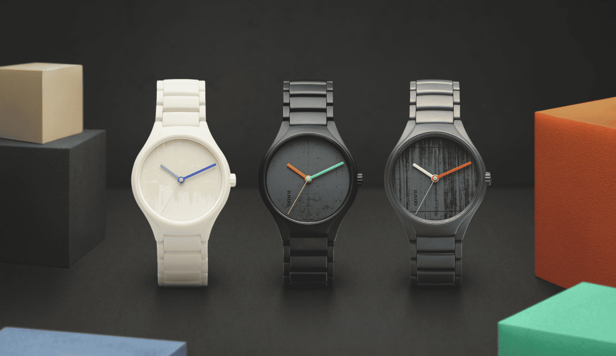
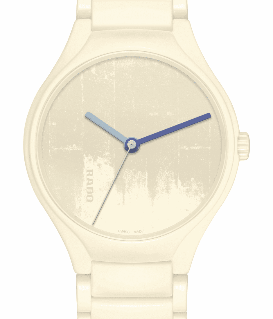
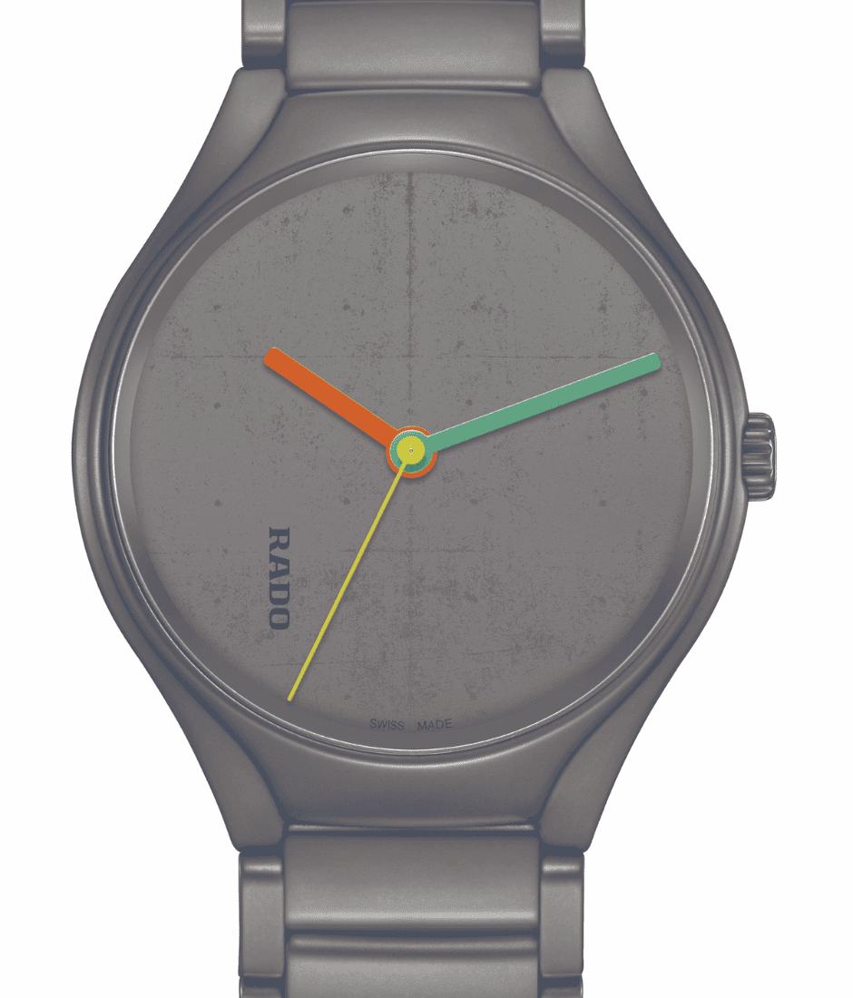
The first watch nods to La Cité Radieuse, the concrete apartment complex Le Corbusier completed in Marseille in 1952 and one of the buildings that helped define Brutalism as a movement. Rado recreates the texture of its raw, board-formed concrete through laser engraving on a high-tech ceramic dial, catching light across every groove.
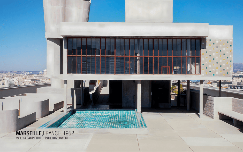
The case, crown, and bracelet arrive in Ivory White, a shade Rado has never before produced in high-tech ceramic. Getting there wasn’t simple: the colour is baked into the material during sintering at 1,450°C rather than applied as a surface coating, which meant years of development to nail the exact tone. Blue hands in three separate shades finish the look, giving the piece a crisp, almost architectural clarity on the wrist.

Carpenter Center, in Iron Grey

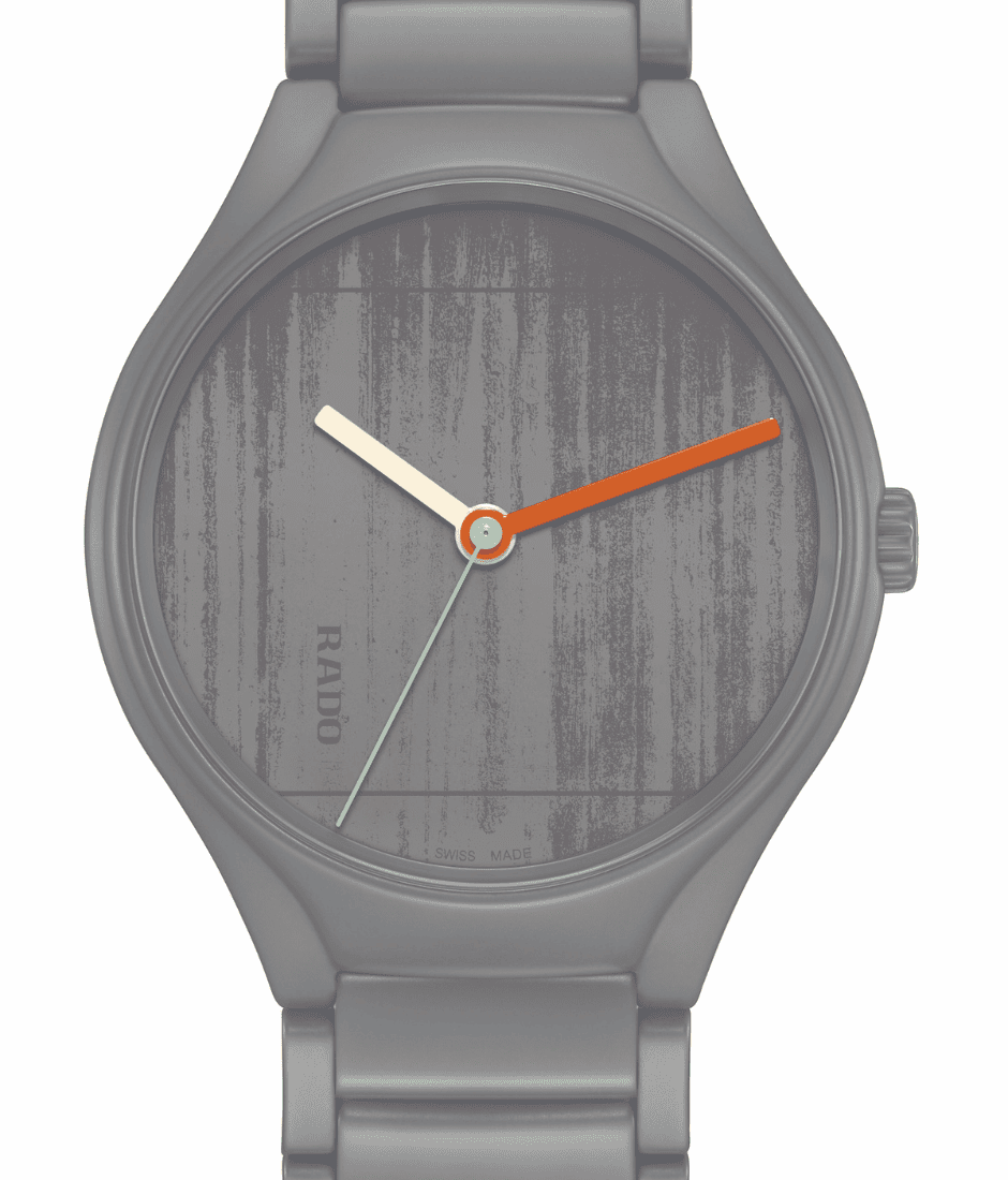
The second watch turns to the Carpenter Center for the Visual Arts in Cambridge, Massachusetts, Le Corbusier’s only building in North America and one of his final projects before his death in 1965. Sitting amid Harvard’s traditional brick and ivy, the Center was famously at odds with its surroundings, and that same tension shows up in the watch.
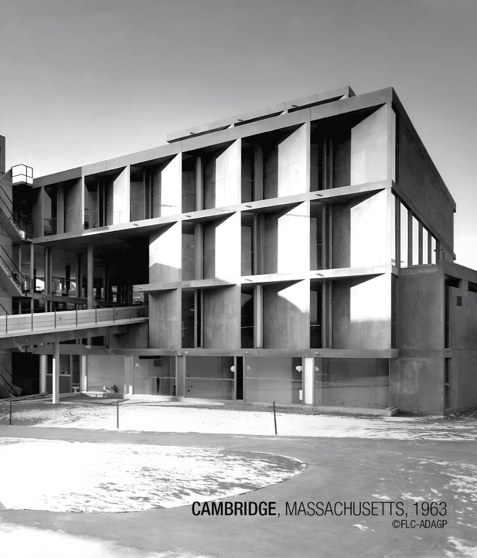
An engraved impression of the building’s sculpted concrete facade covers the dial, set against a case finished in Iron Grey. Lacquered hands in cream, orange, and green punch through the grey tones, echoing the way the Carpenter Center itself broke from its Georgian neighbours.
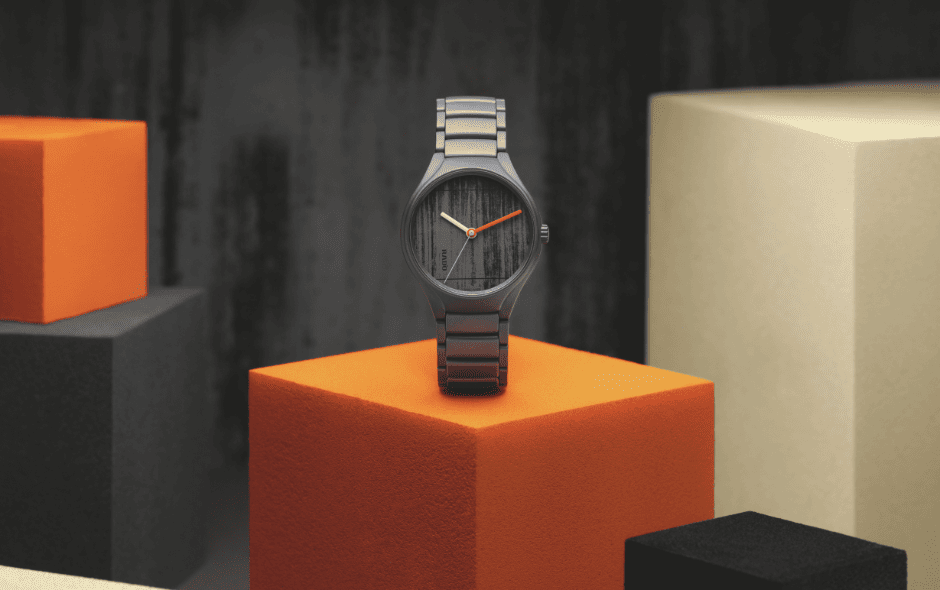
Chandigarh’s Palace of Assembly, in Ivory Black

The final watch in the trio scales up to something far bigger than a single building: Chandigarh, the Indian city Le Corbusier planned from scratch as the new capital of Punjab. Rado’s dial focuses specifically on the Palace of Assembly, part of the Capitol Complex finished in 1962, engraving a fragment of its imposing facade into ceramic.
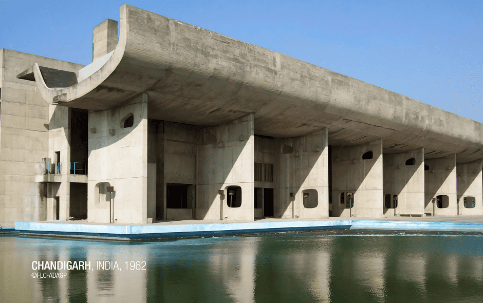
Cased in deep Ivory Black, this is the moodiest of the three Rado watches, offset by lacquered hands in orange and two shades of green. It’s a fitting tribute to a project that, more than any single structure, shaped how cities were planned for the rest of the twentieth century.

What Ties the Three Together
Flip any of these Rado watches over and the connection to Le Corbusier’s colour theory becomes even more obvious: a ring of 63 printed colour strips wraps around the automatic Rado calibre R763 movement, visible through sapphire crystal etched with the architect’s own logo. The same colour strips reappear on the presentation boxes, tying the whole collection together as a single visual statement rather than three unrelated releases.
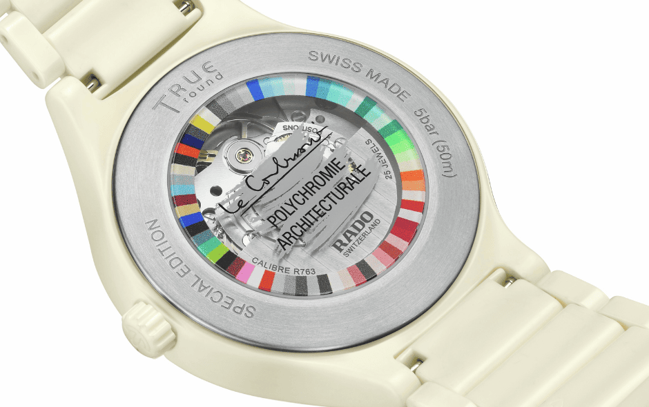
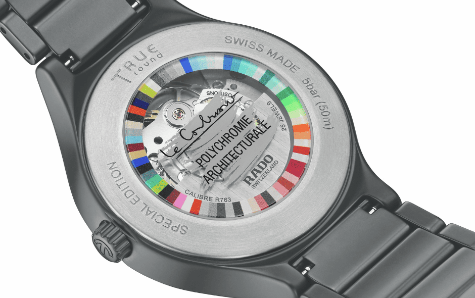
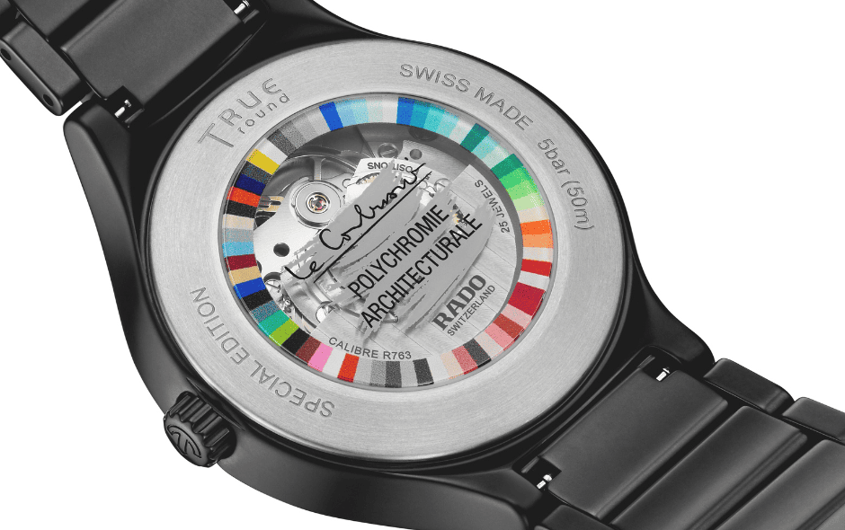
Beyond the design story, these remain proper Rado watches through and through. The monobloc high-tech ceramic construction stays remarkably light on the wrist and warms quickly to match skin temperature, while its scratch resistance holds up to daily wear in a way few materials can match, not unlike the concrete it’s paying homage to. The R763 movement backs that up with an 80-hour power reserve and water resistance to 50 metres, so the collection works as hard as it looks good.
For a brand that calls itself the Master of Materials, this collaboration makes a lot of sense. Rado has spent decades treating material science as a creative language of its own, and pairing that with an architect who did the same with concrete and colour feels less like a marketing exercise and more like a genuine meeting of minds.
For more information on Rado, click here.